
Calls to Action for Home Services Businesses
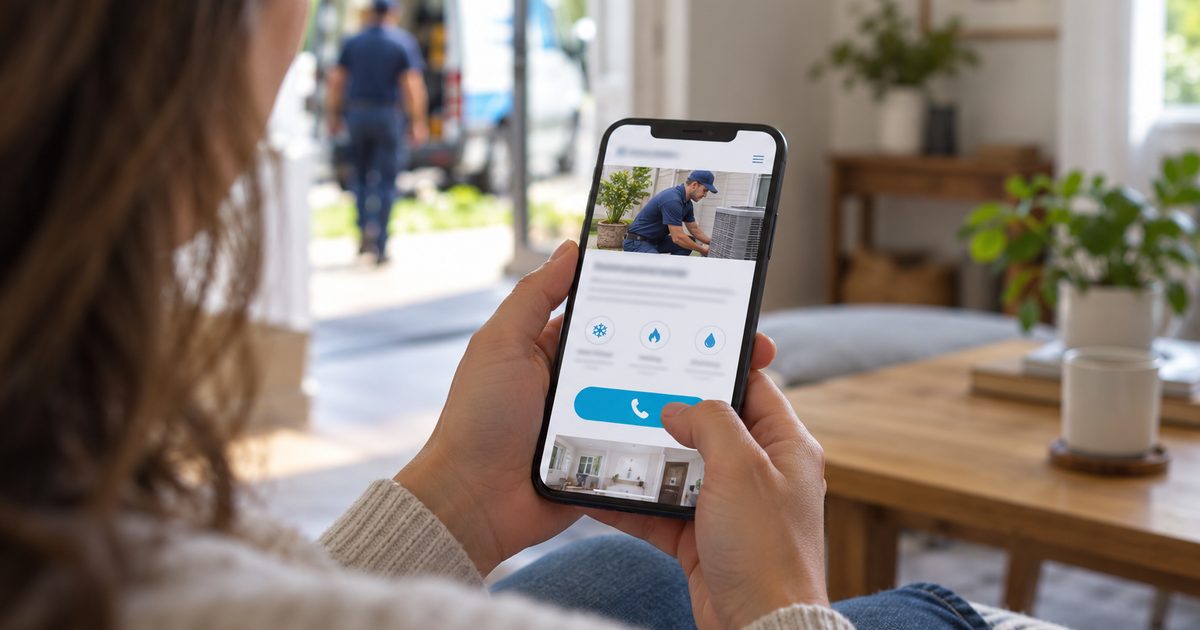
A call to action is the prompt that asks a visitor to take the next step with a business: call, send a request, book an appointment or ask for a quote. It’s made up of the wording, the button or link that carries it, and where it appears on the page. A data-informed call to action is built on how prospective customers actually respond. It asks for the step they’re ready to take, keeps that ask short and direct, and makes it easy to complete from wherever they are on the page.
The right ask depends on how ready the prospective customer is to act:
Illustrative. The ladder shows what to ask for at each stage. What the button itself says is covered in what testing has shown.
A call to action works when it asks for the step the prospective customer is ready to take, and makes that step obvious. At Riley Summers, we build that ask into the landing pages for the campaigns we manage, because it’s the moment where a paid click finally turns into a lead.
On this page
- What a Call to Action Is and Isn’t
- Why the Ask Matters
- The Clear Ask Framework
- What Mark Riley’s Testing Found
- Calls, Forms or Both
- Offers and Urgency
- Measuring Calls to Action
- Call to Action Mistakes We See
What a Call to Action Is and Isn’t
A call to action is the ask itself: the words, the button or link, and where it sits. The rest of the page is built to demonstrate the business’s capability and earn the prospective customer’s trust. The call to action is designed to catch their attention without resorting to gimmicks, and to encourage them to act once that trust is in place. Everything around it, from the page as a whole to what happens after someone calls, is covered on neighboring pages.
| Covered here | Covered elsewhere |
|---|---|
| What to ask the prospective customer to do | The whole service page (Service Pages) |
| How the ask is worded | The whole campaign page (Landing Pages) |
| Where the ask appears and how easy it is to complete | Testing and improving pages over time (Conversion Rate Optimization) |
| Offers and honest reasons to act now | Handling the call once it comes in (Phone Leads and Call Handling) |
| Handling the form once it’s sent (Contact Form Leads) |
Why the Ask Matters
Everything a business spends on ads, search visibility and its website exists to bring prospective customers to this moment. If the page has earned their trust but they can’t see what to do next, the lead is lost at the last step, after the business has already paid to get them there.
The wrong ask loses leads too. A prospective customer with a burst pipe doesn’t want to schedule a consultation, and someone still comparing roof replacements may not be ready to call. When the ask doesn’t match where the prospective customer is, they hesitate, and hesitation is often enough to send them back to the search results.
A well-built call to action closes that gap. It’s clear about what to do, matches how ready the prospective customer is, and makes acting feel like the natural next step rather than a sales push.
How Riley Summers helps: The ask is where ad spend either becomes a lead or doesn’t. On the landing pages for the campaigns we manage, we build the ask on what testing has shown works.
The Clear Ask Framework
These are the five principles we build into the landing pages for the campaigns we manage.
1. Ask for the Step They’re Ready For
The ask should match how ready the prospective customer is. Someone with an emergency needs a way to call now, while someone planning a major project may want to schedule a consultation first. A page can offer more than one ask, as long as the main one fits the people the page is built for (see Types of Home Service Demand).
2. Keep the Ask Short and Direct
The text around a button can set the context. The button itself works best as a plain, direct action. Testing has consistently favored short wording over clever or descriptive labels (see What Mark Riley’s Testing Found).
3. Put the Ask Where the Decision Happens
Prospective customers decide at different points on a page, so the ask should be there whenever they’re ready, not only at the bottom. On our landing pages, the call button sits in the header. On a phone, it also stays fixed on screen as the visitor scrolls, parked just above the bottom edge where a thumb can reach it.
4. Make It Easy to Finish
Once the prospective customer decides to act, nothing should slow them down. On a phone, tapping the number should start the call. A form should ask only for what the business needs to respond.
5. Give an Honest Reason to Act
Real availability, genuine offers and clear next steps give prospective customers a reason to act now. Invented deadlines and false scarcity do the opposite. Prospective customers notice, and it costs the business their trust (see Offers and Urgency).
How Riley Summers helps: A call to action that’s hard to find, unclear or pushy loses leads the business has already paid for. We build these principles into every landing page we create for the campaigns we manage, and keep refining them based on how prospective customers respond.
Are your landing pages asking for the call?
Riley Summers’ free PPC audit reviews your campaigns and the landing pages your ads send prospective customers to, including how each page asks them to call or send a request, and where that ask may be costing you leads.
What Mark Riley’s Testing Found
Mark Riley has run many A/B tests on calls to action across his landing pages, with traffic split evenly between versions and results counted only once they reached statistical significance. Three findings held up again and again:
Form buttons: “Send” and “Send Now.” Plain, direct wording won almost every test that reached statistical significance, against a long list of more descriptive or creative alternatives.
Call buttons: “Call Us 24/7” and “Call 24/7.” These consistently beat many other challengers. They only belong on the page when the business genuinely answers around the clock. When it doesn’t, “Call Now” is the honest choice (see Speed to Lead).
Button color: medium green. In Mark’s first-party data from contact forms, a medium green button drew more clicks than the alternatives tested. Button color is widely debated, and published studies disagree. This is what his own testing showed, not a universal rule.
These results come from Mark’s earlier agency work, not from a single test, and they aren’t a benchmark. On our own landing pages, they’re the starting point that any new idea has to beat.
Calls, Forms or Both
Every landing page we build offers more than one way to make contact, because prospective customers have their own preferences and any genuine lead is worth having. But the methods aren’t equal.
In Mark Riley’s view, a phone call is the ideal outcome. It puts the prospective customer in conversation with someone at the business right away, while their need is fresh and before they move on to a competitor. A contact form or a live chat can be just as genuine, but at some point someone still has to call that person and talk to them. Every form is a call that hasn’t happened yet (see Speed to Lead).
That’s why the call button leads on our landing pages, and the form sits beside it for prospective customers who can’t talk right now or would rather write. Across most of the markets he’s worked, calls outnumbered forms. In one Midwest market, forms came out ahead, which is why both always stay available.
Forms have one advantage of their own. The details a prospective customer types in can be read the moment the lead arrives, while a call takes longer to review. He has used the quality of form leads as an early check on a whole campaign: if the forms are good, the campaign is reaching the right people (see Phone Leads and Contact Form Leads).
How Riley Summers helps: A business shouldn’t have to choose between the leads it prefers and the leads prospective customers prefer to send. On the landing pages for the campaigns we manage, we lead with the call and keep the form beside it, so every prospective customer has a way to reach the business on their own terms.
Offers and Urgency
A good reason to act now can tip a prospective customer from thinking about it to making contact. The reason has to be real, though.
Honest reasons work: same-day service the business can actually deliver, genuine seasonal pricing, a free estimate the business really offers, or appointments that truly fill up during a busy season. Each one tells the prospective customer something true and useful about acting now.
The strongest offer is often the answer to the prospective customer’s first question. In Mark Riley’s experience, that question is usually about cost, so his forms carry it in the heading itself. For a home services business, that might be “Free Estimate” or “Free Inspection,” where the business genuinely offers one. The prospective customer sees the answer to their biggest hesitation at the moment they’re deciding whether to reach out.
Invented urgency works against the business. Countdown timers that reset, “only two spots left” when the schedule is open, or a sale that never ends are easy for prospective customers to spot. Once they’ve caught one, they doubt everything else on the page.
Financing offers need particular care. Advertising payment terms can trigger disclosure rules, so we keep financing wording general unless the business supplies wording its lender has approved (see Financing).
How Riley Summers helps: An offer that isn’t true wins a click and loses a customer. We build calls to action around the real advantages a business can deliver, so the reason to act now holds up when the prospective customer calls.
Measuring Calls to Action
A call to action is measured by how many prospective customers act on it. On the landing pages for the campaigns we manage, every call and every contact form is tracked back to the campaign that produced it, so we can see how many visitors took each step and which ask they used.
When we want to know whether a different ask would do better, we test it against the current one, with traffic split evenly and results counted only once they’re statistically significant. A new version has to beat the proven one on real results before it replaces it (see Conversion Rate Optimization).
Two cautions apply. A call to action that wins more clicks isn’t automatically better if those leads don’t turn into work, so the owner’s feedback on lead quality matters as much as the count. And small differences in a short test can be noise, which is why we wait for enough results before declaring a winner.
Call to Action Mistakes We See
These are the mistakes we most often find when we review how a business’s landing pages ask for the lead.
-
Clever wording instead of a clear ask. Creative button labels can look good on the page but leave prospective customers unsure what happens when they click.
What we do instead: We use short, direct wording that testing has shown prospective customers respond to.
-
The ask is hard to find. The call button appears only at the bottom, or blends into the page.
What we do instead: We place the ask where prospective customers decide, including the header, and make it stand out without being garish.
-
No easy way to call on a phone. The number can’t be tapped, or the call button scrolls out of sight.
What we do instead: We keep a tap-to-call button fixed within thumb reach as the visitor scrolls.
-
Asking for the wrong step. An emergency page asks prospective customers to book a consultation, or a major-project page pushes them to call before they’re ready.
What we do instead: We match the main ask to how ready the page’s prospective customers are.
-
Forms that ask for too much. Every extra field is another reason to give up before pressing send.
What we do instead: We ask only for what the business needs to respond.
-
A 24/7 promise the business can’t keep. “Call Us 24/7” wins clicks, but a prospective customer who calls at night and reaches no one won’t call back.
What we do instead: We use 24/7 wording only when the phones are genuinely answered around the clock, and “Call Now” when they aren’t.
-
Invented urgency. Fake deadlines and false scarcity cost the business trust.
What we do instead: We build the reason to act on real availability and genuine offers.
-
Changing the ask on a hunch. A proven call to action gets replaced because someone thinks a new idea will do better.
What we do instead: We keep the proven version until a new one beats it in a fair test.
Related Resources

About The Author
Mark Riley is a marketing executive and the founder of Riley Summers Marketing Group, where he leads customer acquisition strategy for law firms and home services businesses across paid search, Google Local Services Ads, local SEO and paid social media. He rose to VP of Digital at a national legal-marketing agency, where the digital programs he led generated a significant share of its revenue. Over a 15+ year career, he has managed more than $70 million in digital advertising spend, much of it in one of the most expensive and competitive advertising categories in North America. He measures marketing by what it costs to win a booked job, not by traffic or lead volume.