
Website Accessibility for Home Services Businesses
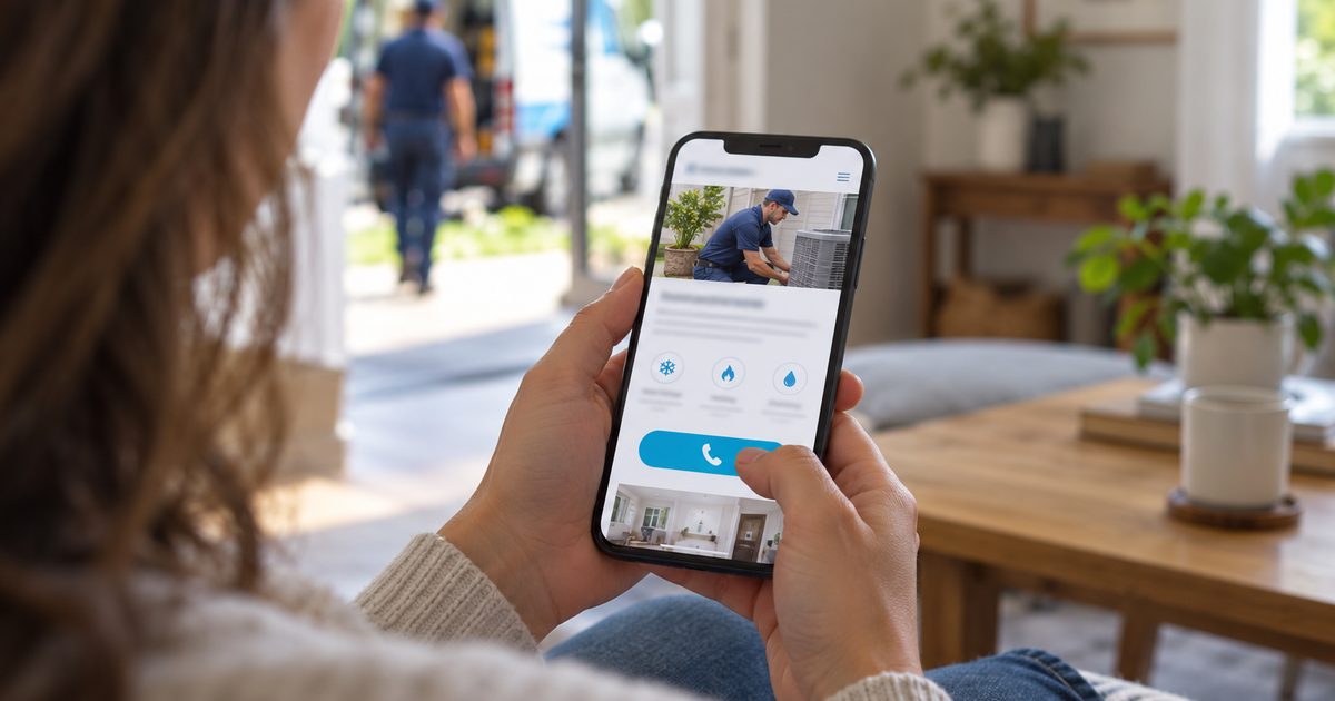
Website accessibility means building and maintaining a website so people with different abilities can find information, move around the site and contact the business, including people who use screen readers, keyboards, voice controls or enlarged text. For a home services business, it removes barriers between customers and the services they’re trying to reach.
Illustrative only. Four customers, one website, the same chance to get in touch.
Every customer the marketing reaches should have a usable way to learn about the business’s services and contact it, whatever their ability.
On this page
- What Website Accessibility Covers
- Why Accessibility Matters to Home Services Businesses
- The Open Door Framework
- Common Accessibility Barriers
- How Website Accessibility Is Evaluated
- Website Accessibility Mistakes We See
- Website Accessibility and the ADA
- What Riley Summers Evaluates
- Related Resources
What Website Accessibility Covers
Website accessibility covers whether people with different abilities can read a page, move around it, understand it and complete the actions that matter: calling the business, submitting a contact form or finding the information they came for. It’s about how the page is built, not how it looks, so most of it is invisible to visitors who don’t need it. At Riley Summers, we treat accessibility as part of good page design: when a page is built properly, the tools customers already rely on can do their job.
Several related topics have their own pages:
- Mobile User Experience: whether a page is comfortable to use on a phone. A page can work well on a phone and still be unusable with a screen reader.
- Website Performance: whether a page loads quickly, stays steady and keeps working.
- Conversion Rate Optimization: testing changes that turn more visitors into leads. Accessibility fixes often make pages clearer for everyone, but conversion work covers far more.
Why Accessibility Matters to Home Services Businesses
More than one in four U.S. adults has some type of disability, according to the CDC. Not every disability affects how someone uses a website, but vision and cognitive differences often do. Those customers still have leaking pipes, failing air conditioners and roofs that need replacing, and they’re looking for a business to call like anyone else.
Most of them already use their own tools: a screen reader, enlarged text, voice control or keyboard navigation. Those tools can only work with what the page gives them. A form field without a label, a button without a name, or an offer that exists only in an image leaves the customer’s tools with nothing to read, and the customer with no way to get in touch.
By the time these customers arrive, the marketing has already done its job. When the page shuts them out, the business loses the inquiry and the customer calls someone else. Accessible pages also tend to be clearer for everyone: plain labels, readable contrast and a predictable layout help every customer find the number and get in touch.
How Riley Summers helps: These barriers rarely appear in a report. A customer who can’t use the form never shows up as a lead. We build our campaign landing pages with accessibility in the code, so customers’ own tools can do their job, and in our reviews we point out the barriers we find on the pages a business’s marketing sends customers to.
The Open Door Framework
We evaluate a page’s accessibility through four questions. They’re our plain-language reading of the four principles behind the W3C’s Web Content Accessibility Guidelines (WCAG): perceivable, operable, understandable and robust.
The Open Door Framework
1. Can They Perceive It? Customers can take in the information whether they see it, hear it or have it read aloud. That means enough contrast between text and background, text that can be enlarged without breaking the page, and written descriptions for images that carry information, like an offer or a financing message.
2. Can They Use It? Customers can move around the page and take action with whatever they use: a mouse, a keyboard, a touchscreen or voice control. Menus open, form fields can be reached in order, and the call button works without a mouse.
3. Can They Understand It? The wording, instructions and layout are clear and predictable. Form fields say what they’re asking for, and when something goes wrong, the error message says what to fix.
4. Does It Work With Their Tools? Browsers, screen readers and other assistive technology can correctly interpret the page and its controls. A button is coded as a button and a form label is tied to its field, so the customer’s own tools can do the rest.
How Riley Summers helps: These four questions are part of how we build campaign landing pages, which are typically built to WCAG 2.1 Level A, the standard’s baseline. Accessibility is part of the page’s code, not added on top. Where a client needs a higher level, we can work toward AA.
Common Accessibility Barriers
These are the barriers that most often come between a customer and the business on a home services website.
| Barrier | Who it affects | What happens to the customer |
|---|---|---|
| Low-contrast text or buttons | People with low vision | Important information and buttons are hard to make out |
| Hard-to-read text: very small type, text over busy background photos, long dense blocks | People with low vision, reading difficulties or cognitive disabilities | They struggle to read the service details and may give up before finding the number |
| Images without alt text | People using screen readers | Project photos, license and certification badges, and other proof are skipped or read as a file name |
| Offers shown only in images | People using screen readers | The offer, discount or financing message isn’t read aloud, so they never hear it |
| Video without captions | People who are deaf or hard of hearing | They miss whatever the video explains about the business or the service |
| Form fields without labels | Screen reader and voice-control users | They can’t tell what each field is asking for |
| Controls that need a mouse | People navigating by keyboard | Menus, forms or the submit button can’t be reached |
| Call buttons and links with no clear name | People using screen readers | They hear “link” or “button” with no idea where it goes |
| CAPTCHAs without an accessible option | People using assistive technology | They can’t complete the contact form |
| Unclear form errors | People with cognitive or visual disabilities | They don’t know what went wrong or how to fix it |
Each of these gives an interested customer another reason to give up on the inquiry and call someone else.
How Website Accessibility Is Evaluated
Accessibility is evaluated against the W3C’s Web Content Accessibility Guidelines (WCAG). The current version is WCAG 2.2, and each version has three levels: A (the baseline), AA and AAA. Which version and level matters for a particular business can depend on a law, a contract or a client requirement, so the standard and what’s required of a business aren’t always the same thing.
No single test proves a page is accessible. A full evaluation uses three methods, each catching what the others miss:
| Method | What it shows |
|---|---|
| Automated scans | Problems a tool can detect, such as missing labels, missing alt text and some contrast failures |
| Manual review | Whether a person can move through the page by keyboard, follow the order of the page, complete the form and understand the errors |
| Testing with assistive technology | How the page actually comes across to someone using a screen reader or similar tool |
Automated scans are a useful first pass, but a page that passes one hasn’t been shown to be fully accessible or legally compliant. Many barriers, like a confusing form error or a page that’s hard to move through by keyboard, only show up when a person checks.
How Riley Summers helps: Our campaign landing pages are built from a tested design. We checked its accessibility when the layout was developed, and each new page follows the same proven structure, so the basics, like labeled form fields, a call button that works by keyboard and offers written as real text, are part of every page from the start.
Website Accessibility Mistakes We See
These are the mistakes we most often find when we review a home services business’s website and campaign pages.
- Relying on an overlay widget. Installing an accessibility widget doesn’t, by itself, establish that a website meets accessibility standards. In 2025, the FTC ordered one overlay vendor, accessiBe, to pay $1 million over claims that its widget could make any website WCAG-compliant. Mark Riley has used an overlay widget in the past. When he later worked with an enterprise WordPress development firm on a platform build, its accessibility specialists advised against overlay apps. The platform was built with accessibility in its code, and the sites on it didn’t need a widget. Older sites that weren’t rebuilt kept theirs. What we do instead: we build accessibility into the page’s code, so customers’ own tools can do their job.
- Putting the offer in an image. Discounts, financing messages and phone numbers designed into a banner graphic look polished, but a screen reader can’t read them. What we do instead: offers, prices and phone numbers on our campaign landing pages are written as real text.
- Labels that disappear. Forms that use placeholder text instead of labels lose the instruction as soon as the customer starts typing, and screen readers may not announce it at all. What we do instead: every form field on our campaign landing pages is labeled.
- Treating a passing scan as proof. An automated scan catches only part of what can go wrong. A page can pass and still be hard to use by keyboard or confusing when a form error appears. What we do instead: we treat a scan as a first pass, not a verdict.
- Treating accessibility as a one-time project. A site can be accessible at launch and drift as new pages, images, plugins and videos are added without alt text, labels or captions. What we do instead: every new campaign landing page follows our tested structure, and in our reviews we look at pages added since launch, not just the original build.
- Building pages that require a mouse. Some websites work perfectly with a mouse but become hard or impossible to use with a keyboard. Navigation menus, pop-ups, booking forms and call buttons may be out of reach for customers who rely on keyboard controls. What we do instead: our campaign landing pages are built so the form and call button can be reached and used by keyboard.
- Text and buttons that are hard to make out. Light gray text, low-contrast buttons and text placed over photographs make important information hard to read. It does the most damage when the affected element is the phone number, the estimate button or the form instructions. What we do instead: in our reviews, we flag low-contrast text and controls, starting with the ones customers need in order to get in touch.
- Form errors that don’t explain themselves. A customer fills out a contact form, presses Submit, and nothing seems to happen. Or an error appears only as a red outline, with no explanation. Customers using screen readers may never know why the form failed. What we do instead: in our reviews, we check whether a form explains what went wrong when it can’t be submitted, not just which fields are required.
- Forgetting customers who enlarge text. A page can look fine at its normal size and break when someone increases the text size. Buttons overlap, navigation disappears or form fields run off the screen. What we do instead: in our reviews, we check whether the page still works with enlarged text, especially the contact options.
Website Accessibility and the ADA
The Department of Justice has long taken the position that the Americans with Disabilities Act applies to the goods and services businesses open to the public offer online. Its 2022 guidance on web accessibility says there is no regulation setting out detailed technical standards for private businesses. It points to WCAG as helpful guidance, and businesses can choose how they make their websites accessible.
The DOJ’s 2024 rule that sets WCAG 2.1 Level AA as the standard applies to state and local governments, not private businesses in general. For private businesses, what’s required can depend on the business and on how courts interpret the law. Those interpretations have varied.
The issue isn’t theoretical. A 2026 local news investigation counted nearly 4,000 federal lawsuits over website accessibility filed in 2025 alone, many against small local businesses.
We’re a marketing agency, not a law firm. Nothing here is legal advice, and a business with questions about its own obligations should talk to a qualified attorney. What we can say is that accessibility built into a site’s code puts a business in a stronger position than a widget added on top.
What Riley Summers Evaluates
We evaluate accessibility as part of the marketing, not as a separate compliance project. Depending on the services a client engages us for, that covers two areas:
- The campaign landing pages we build and manage. Our campaign landing pages are typically built to WCAG 2.1 Level A, with accessibility in the code rather than added on top. Every new page follows the same tested structure. Where a client needs a higher level, for example because of a contract or legal advice, we can work toward AA.
- Websites we review. In an executive-level website review, accessibility is one of the things we evaluate, alongside performance, how the site is organized and how easily a customer can get in touch. We look for the barriers that most often stand between a customer and the business: offers in images, unlabeled form fields, unclear form errors, low-contrast text and pages that don’t work by keyboard.
A review identifies visible and detectable accessibility concerns. It isn’t a full accessibility audit, and it isn’t a determination of legal compliance. Where a business needs either of those, we’ll say so.
How Riley Summers helps: Few marketing agencies raise accessibility at all, and fewer explain what it means for the business. Our reviews put accessibility in practical terms: which customers a page may be shutting out, and which of those barriers sit on the paths that lead to a call or an inquiry.
Could your website be shutting out customers your marketing already reached?
Riley Summers offers a free website review for home services businesses. We’ll evaluate the pages your customers use to get in touch and point out the accessibility barriers we find, along with any performance or usability issues that may be costing you calls and inquiries.
Related Resources

About The Author
Mark Riley is a marketing executive and the founder of Riley Summers Marketing Group, where he leads customer acquisition strategy for home services businesses across paid search, Google Local Services Ads, local SEO and paid social media. He rose to VP of Digital at a national legal-marketing agency, where the digital programs he led generated a significant share of its revenue. Over a 15+ year career, he has managed more than $70 million in digital advertising spend, much of it in one of the most expensive and competitive advertising categories in North America. He measures marketing by what it costs to win a booked job, not by traffic or lead volume.