
Mobile User Experience for Home Services Businesses
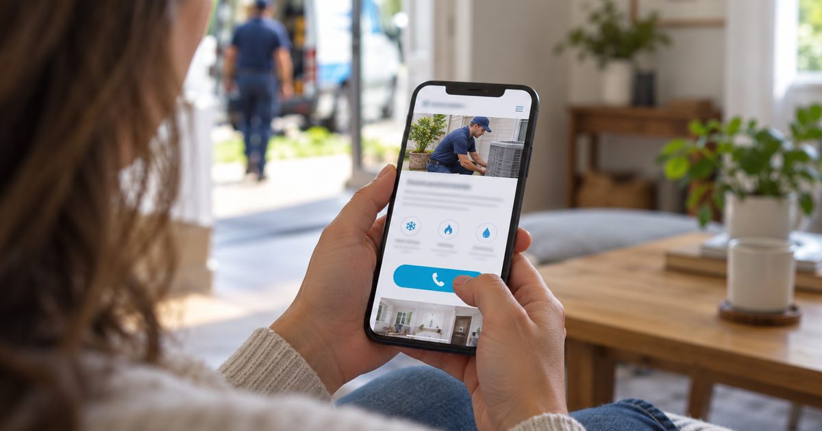
Mobile user experience is how easily a prospective customer can use a business’s website on a phone: finding the service they need, trusting the business, and making contact. It covers how quickly the page becomes usable, what appears first on a small screen, how easy buttons and forms are to use with a finger, and whether everything can be read without zooming. A strong mobile experience doesn’t make prospective customers work harder simply because they’re using a smaller screen.
Here’s how comfortable reach works on a phone, on a business’s website and on a landing page built for an ad campaign:
Homeowners use their phones to find help, compare providers and make contact. A website that’s hard to read, navigate or use on a small screen can lose prospective customers before they ever reach the business. At Riley Summers, we review how a business’s website works for mobile visitors, and the landing pages we build are designed for all visitors, optimized for both phones and desktops from the start.
On this page
- What Mobile User Experience Is and Isn’t
- Why Mobile Matters for Home Services
- The One Thumb Framework
- Desktop vs. Mobile: What Changes
- Measuring Mobile Experience
- Mobile Experience Mistakes We See
What Mobile User Experience Is and Isn’t
Mobile user experience is about how a business’s web pages work in a prospective customer’s hand: what they see first on a small screen, how easily they can tap, read and fill in a form, and how quickly they can reach the business. It also covers how easily they can move through the website itself on a phone, since the website is the route that connects every page, from the home page to service pages. Landing pages built for ad campaigns follow the same principles, even though they stand on their own.
It overlaps with several neighboring topics without replacing them. How fast a page loads and how well it holds up technically is covered in Website Performance. Readable text and easy-to-tap buttons help everyone on a phone, but the full requirements for visitors with different abilities are covered in Website Accessibility. What the business asks visitors to do, and how that ask is worded, is covered in Calls to Action. The complete makeup of a single page is covered in Service Pages and Landing Pages.
Why Mobile Matters for Home Services
Many home services problems are discovered at home, and the phone is the device in hand when they are. A homeowner who finds water spreading across the floor searches on their phone, reads on their phone and calls from their phone. For those prospective customers, the mobile experience is the whole experience.
The phone matters for slower decisions too. A homeowner researching a roof replacement may read about options on their phone over several evenings, compare contractors’ reviews, and only later sit down to request a quote. The mobile experience has to support whatever decision the prospective customer is making at that moment, whether that’s an immediate call or a careful comparison (see Types of Home Service Demand).
Mark Riley’s campaign data shows how differently people make contact by device. Roughly 7 out of 10 calls came from phones. Contact forms ran the other way: most came from desktops, and those forms often carried more detail. Mark believes a full keyboard is the likely reason, since typing a detailed message is far easier on a computer than on a phone.
That’s why the phone version of a page should make calling effortless, while the desktop version gives the form the space it deserves. The same person may also research on one device and make contact on another, which is why both have to work.
How Riley Summers helps: A business can lose its most urgent prospective customers to a page that’s awkward on a phone, and its most considered ones to a page that’s awkward on a desktop. We review how a business’s website works on both, and build our landing pages for all visitors from the start.
The One Thumb Framework
The One Thumb Framework is the standard we use to evaluate how a business’s web pages work on a phone, and the standard we design our own landing pages to. The name is a principle, not a literal rule: a prospective customer holding a phone in one hand should be able to understand the business and make contact without struggling.
1. Don’t Make Prospective Customers Wait
A page that takes too long to become usable loses people before they’ve seen anything. We look at whether the page is ready to use promptly on a phone. The technical side of speed is covered in Website Performance.
2. Put What Matters First
A small screen has no room for clutter. Pages built for phones need less text and more visuals: a photo of the team, a clear headline, and icons that show at a glance why the business can be trusted. The service, the area and the way to make contact should be clear without the prospective customer having to read their way down the page.
3. Keep Important Actions Easy to Reach
Calling and making contact should be easy wherever the prospective customer is on the page. On our landing pages, a call button sits in the header where a website’s menu would be, and a bar fixed at the bottom of the screen holds call and contact buttons within easy reach of a thumb. Those buttons are placed so they never cover the content or a form field the visitor is trying to use.
4. Make Mobile Forms Manageable
Typing on a phone is slow and error-prone. Forms should ask only for what the business needs, bring up the right keyboard for each field, and be easy to finish with a thumb (see Contact Form Leads).
5. Make Everything Easy to Read and Use
Text should be readable without zooming, buttons large enough to tap without precision, and nothing should require scrolling sideways. Much of this also helps visitors with different abilities, which is covered in more depth in Website Accessibility.
How Riley Summers helps: A prospective customer shouldn’t have to work harder because they’re on a phone. We evaluate how a business’s web pages hold up against these five standards, and build our landing pages to meet them for every visitor, on phones and desktops alike.
Is your website easy to use on a phone?
Riley Summers’ free website review looks at how easily mobile visitors can find your services, move through your website and contact your business, and where your pages may be losing them.
Desktop vs. Mobile: What Changes
A prospective customer on a phone wants the same things as one on a desktop, but the way they get them changes:
| Desktop | Phone | |
|---|---|---|
| Screen space | More information visible at once | Content has to work in a narrow column |
| Getting around | Mouse, keyboard and full menus | Touch, compact menus and scrolling |
| Making contact | Forms are common, and calling may mean picking up another device | Calling is one tap away, and most calls come from phones |
| Forms | A full keyboard makes detailed messages easy | A touch keyboard makes typing slower, so shorter forms work better |
| Tapping and clicking | A precise pointer | Finger-sized targets and varying reach |
| Reading | Room for side-by-side layouts | Content flows top to bottom, so visuals carry more of the message |
The same person often uses both, researching on one device and making contact on the other. That’s why both versions of a page have to work, and why device figures need to be read with care.
Measuring Mobile Experience
A page’s mobile experience is measured by whether prospective customers on phones can find what they need and make contact. We look at three kinds of evidence:
| Measurement | What it can show |
|---|---|
| Inquiries from phones | Calls and contact forms from mobile visitors, and the share who make contact |
| Usability signals | Where mobile visitors stop scrolling, tap the wrong button by mistake, or give up partway through a form |
| Device comparison | Differences between phone and desktop results that are worth investigating |
A tap on the call button isn’t the same as a call. Someone may tap and hang up before it connects, so we count calls once they connect and last long enough to be real inquiries (see Phone Leads).
A lower conversion rate on phones doesn’t automatically mean the mobile experience is poor. Phone visitors often include more people researching, and many make contact later from another device. The comparison tells us where to look, not what’s wrong. On pages that rank well but convert fewer visitors than we’d expect, heat maps show where phone visitors tap, scroll and stop.
One common problem is known in the industry as the fat-finger problem: buttons and links placed so small or so close together that people tap the wrong one by mistake. A layout that looks well spaced on a monitor can be frustrating in the hand, and a prospective customer who keeps hitting the wrong button often gives up.
Mobile Experience Mistakes We See
These are the mistakes we most often find when we review how a business’s web pages work on a phone.
-
Treating the phone version as a smaller desktop. The desktop layout is squeezed onto a small screen without rethinking how people use it.
What we do instead: We evaluate the phone version as its own experience, and design our landing pages for phones and desktops separately.
-
Too much text, too few visuals. Long paragraphs that work on a desktop become a wall of text on a phone.
What we do instead: We look for photos, icons and short headlines to carry the message, with detail available further down for those who want it.
-
The service and contact buried. Prospective customers have to scroll or open menus before they can tell what the business does or how to reach it.
What we do instead: We look for the service, the area and a way to make contact to be clear on the first screen.
-
Buttons that are hard to tap. Buttons and links are too small or too close together, so prospective customers hit the wrong one by mistake, the fat-finger problem.
What we do instead: We look for buttons large enough and spaced far enough apart to tap accurately.
-
Fixed elements that get in the way. Sticky banners, chat widgets or buttons cover the content or the form field the visitor is trying to use.
What we do instead: We keep fixed call and contact buttons clear of the content, so they help without obstructing.
-
Forms that are hard to finish on a phone. Too many fields, the wrong keyboard, or fields too small to tap turn a simple request into a chore.
What we do instead: We look for short forms that bring up the right keyboard and can be finished with a thumb.
-
Text that needs zooming or sideways scrolling. Small type, cramped layouts or content wider than the screen force the prospective customer to pinch and drag.
What we do instead: We look for text that’s readable at its normal size and pages that fit the screen.
Related Resources

About The Author
Mark Riley is a marketing executive and the founder of Riley Summers Marketing Group, where he leads customer acquisition strategy for law firms and home services businesses across paid search, Google Local Services Ads, local SEO and paid social media. He rose to VP of Digital at a national legal-marketing agency, where the digital programs he led generated a significant share of its revenue. Over a 15+ year career, he has managed more than $70 million in digital advertising spend, much of it in one of the most expensive and competitive advertising categories in North America. He measures marketing by what it costs to win a booked job, not by traffic or lead volume.